Angus Nunes
- All
- 404 Pages (1)
- About Us Section (3)
- Accordion (1)
- Box Styles (4)
- Button (3)
- Coming Soon (2)
- Contact Form (5)
- cPanel (1)
- CSS (13)
- Email Templates (2)
- Faq (2)
- Hover (3)
- Hover Box (7)
- Masonry Grid (4)
- Navigation Bar (5)
- PHP (1)
- Popup Forms (4)
- Section Layouts (7)
- Team Slider (8)
- Testimonial Slider (17)
- Timeline (3)
- Uncategorized (9)
- Website Footer (3)
November 22, 2023
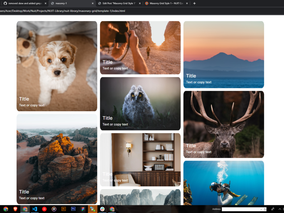
The masonry Grid contains 3 columns in desktop and 2 in Mob. Hence column 3 will combine into column 1 retaining the sizes according to the mobile design of column 1 and pushes the images to the next Column. The grids will be Sets of 3 (Big, Medium, Small) so its easy to understand and copy for new grids and sets (the sets will be used only to understand the arrangement). Keep adding images into the sets by duplicating the last card of each set to maintain the design.

